Splital just moved from a red color palette to a blue one. The change isn't cosmetic, it's based on what research says color does to how you feel when you open an app about money.
When we first designed Splital, we picked red because it stood out. After one year of building the app and talking to users, we realized the color was working against what Splital is actually for.
What changed in the app
The redesign touches three areas:
- Primary color. Buttons, headers and accent colors moved from red to a calmer blue palette.
- Backgrounds and cards. Subtle tone changes that improve contrast between text and background, which helps readability in low light.
- Where red still shows up. It still appears on amounts you owe, so outgoing money stays visually distinct from incoming money at a glance. Everywhere else, the interface stays calm.
What didn't change: the structure of every screen, the gestures, the location of every button. If you've been using Splital for months, you won't have to relearn anything.
Why color matters more than we expected
The science on color and emotional response is well-established. A widely cited University of British Columbia study published in Science tested how red and blue environments affected cognitive performance in nearly 600 participants. The result: blue environments boosted creative tasks and a sense of safety, while red environments improved attention to detail but also raised tension and alertness.
That maps cleanly onto a finance app. The whole interface shouldn't feel like a stop sign every time you open it, the dominant tone should be calm and trustworthy, with alertness reserved for the moments that actually need attention.
Red still earns its place there. It has strong cultural associations with warning, urgency, and loss. We kept it for amounts you owe so outgoing money draws the eye immediately, but using it as the dominant color across the whole app was the wrong choice.
Why blue fits Splital
Blue carries quieter associations than red: water, sky, calm spaces. When you open Splital to check what your roommate owes, the screen should make you feel welcome, not put you on alert. That's the feeling we wanted the new palette to carry, calm enough to think clearly, but readable enough to act fast when you need to.
The new palette also gave us room to improve accessibility:
- Contrast. We use WCAG AA as our target for body text, headings, and anything you read. Slightly darker backgrounds in the new palette help us meet that target on more screens, with stronger contrast and better readability overall.
- Balances stand out more. Owed vs owing is still red and green, that pairing works and we kept it. The difference is that red no longer competes for attention everywhere else in the app, so the red/green signal on balances is easier to spot at a glance.
- Less eye strain. Darker backgrounds and softer surfaces give the new palette more depth, with sharper card boundaries and quieter contrast in the spots that don't need attention, easier on the eyes when you check expenses late at night.
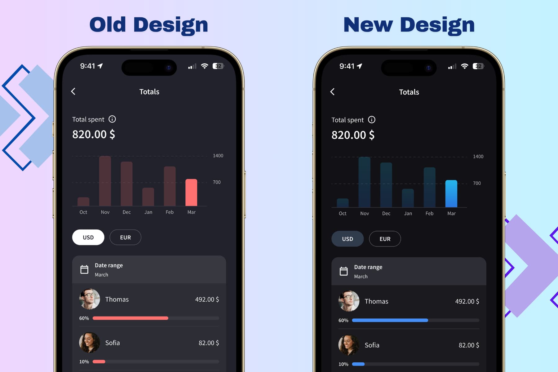
Splital before and after the redesign: red to blue, calmer mood, same structure.
Small change, intentional reasons
A color change sounds trivial, but it's one of the few things you notice every time you open the app. We took our time because the choice has to match what Splital is for: calm, fair, low-friction money tracking with people you care about.
If the new design feels off or you spot a contrast issue we missed, write to [email protected]. The redesign shipped after weeks of testing, but real-world feedback is how we keep refining it.
Maria & Maurizio